

borderlands restoration network
BRN is composed of three main branches: the native plant program, nursery + seeds, and the nature preserve. However, a fragmented online presence (multiple websites + social media) is a direct impediment to communicating BRN's unified mission and creates significant user frustration and internal inefficiency. A consolidated information architecture is essential to reflect BRN's "network" strength and clarify its diverse, interconnected programs. This case study aims to showcase human stories, local impacts, and "boots-on-the-ground" authenticity to inspire greater engagement and donations with an emphasis on content recommendations and web strategy.
“Information Architecture is the organization, search, and navigational systems that help people complete tasks, find what they need, and understand what they found.”
objectives
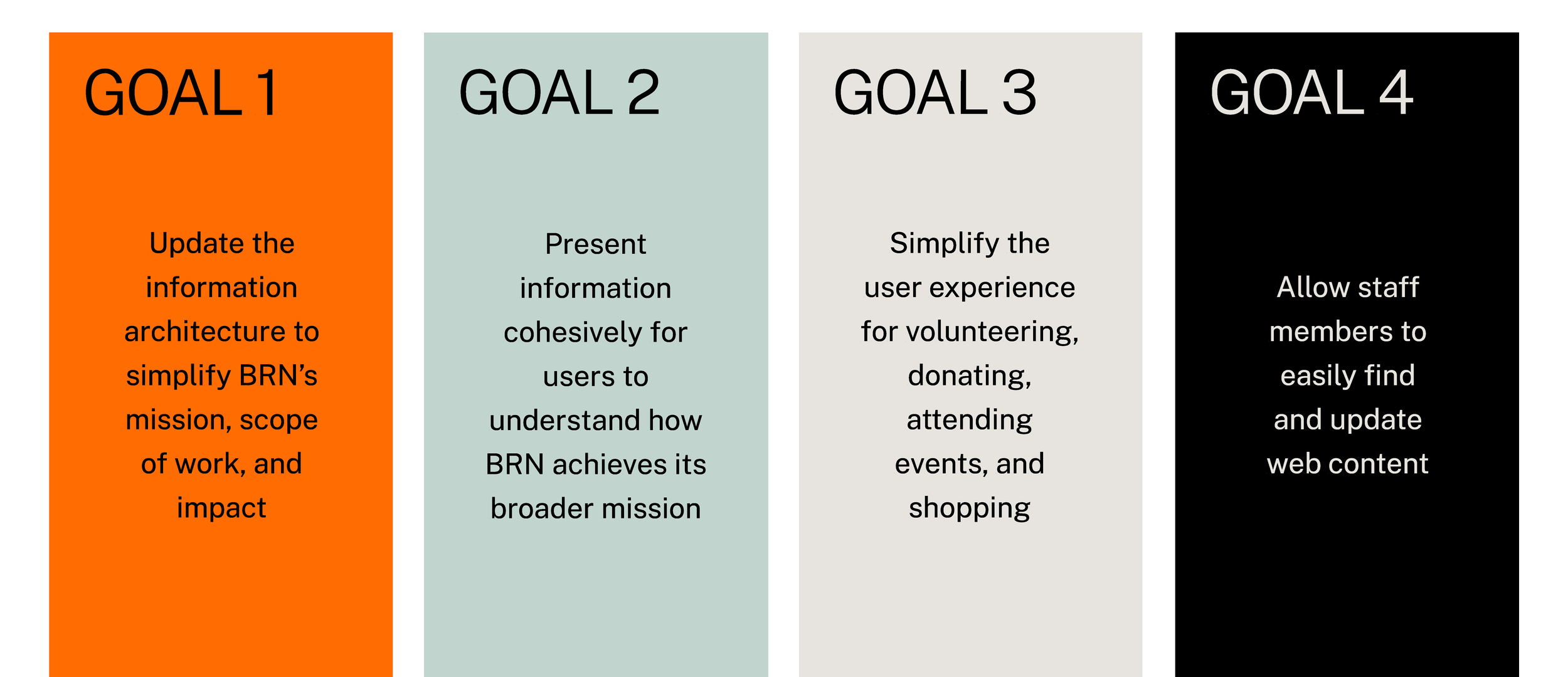
BRN expressed a strong desire for enhanced clarity. How do we get the right content to the right people at the right time? This became our focus going into this project.
We had four main objectives when developing recommendations for BRN:
process
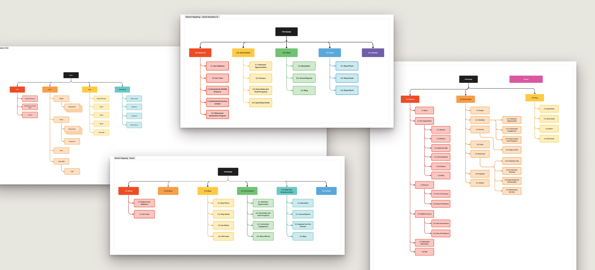
Throughout the project, we used a variety of tools to plan, organize, and execute our research and strategy. For the process phase, we relied on data from interviews conducted with both stakeholders and users. Notes from the interviews were compiled and synthesized. This information was used to create iterative sketch work of diagram variations in progress.
challenges + priorities
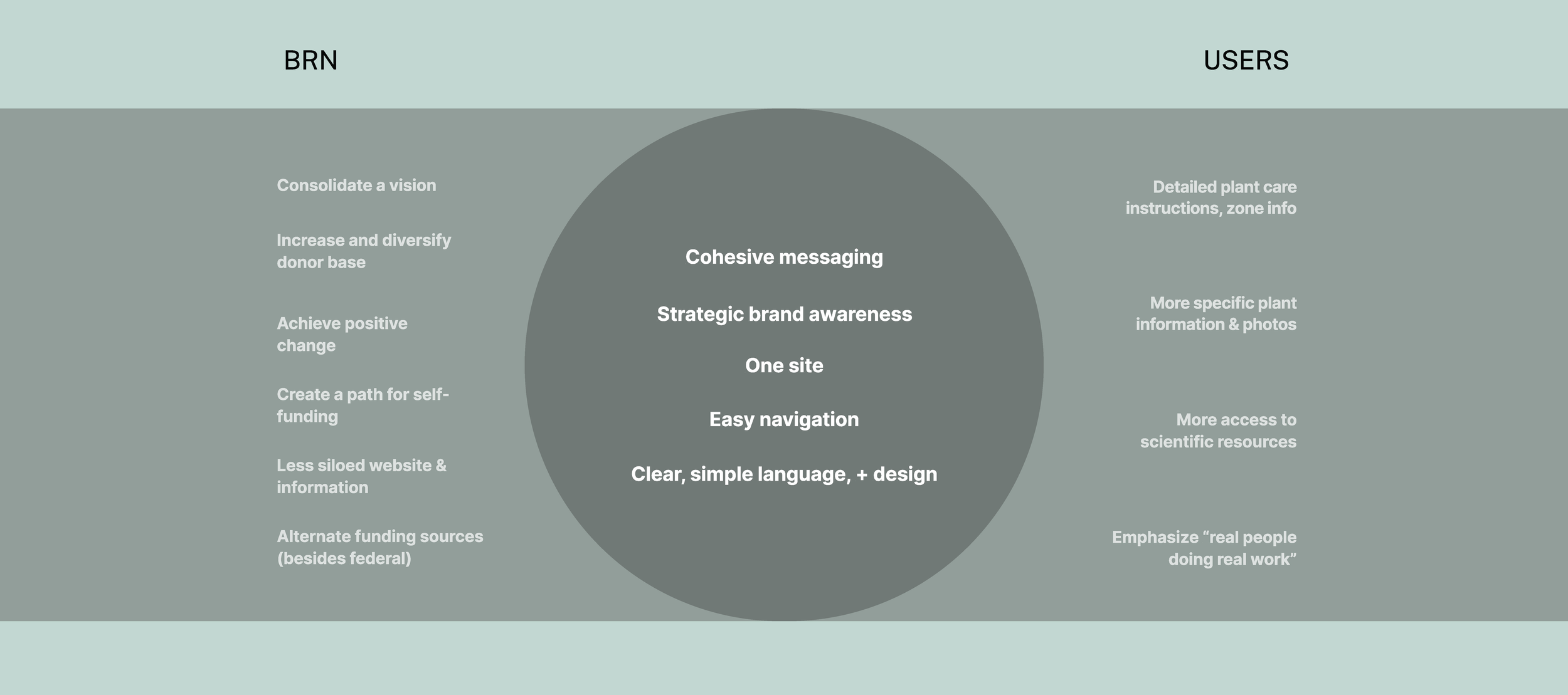
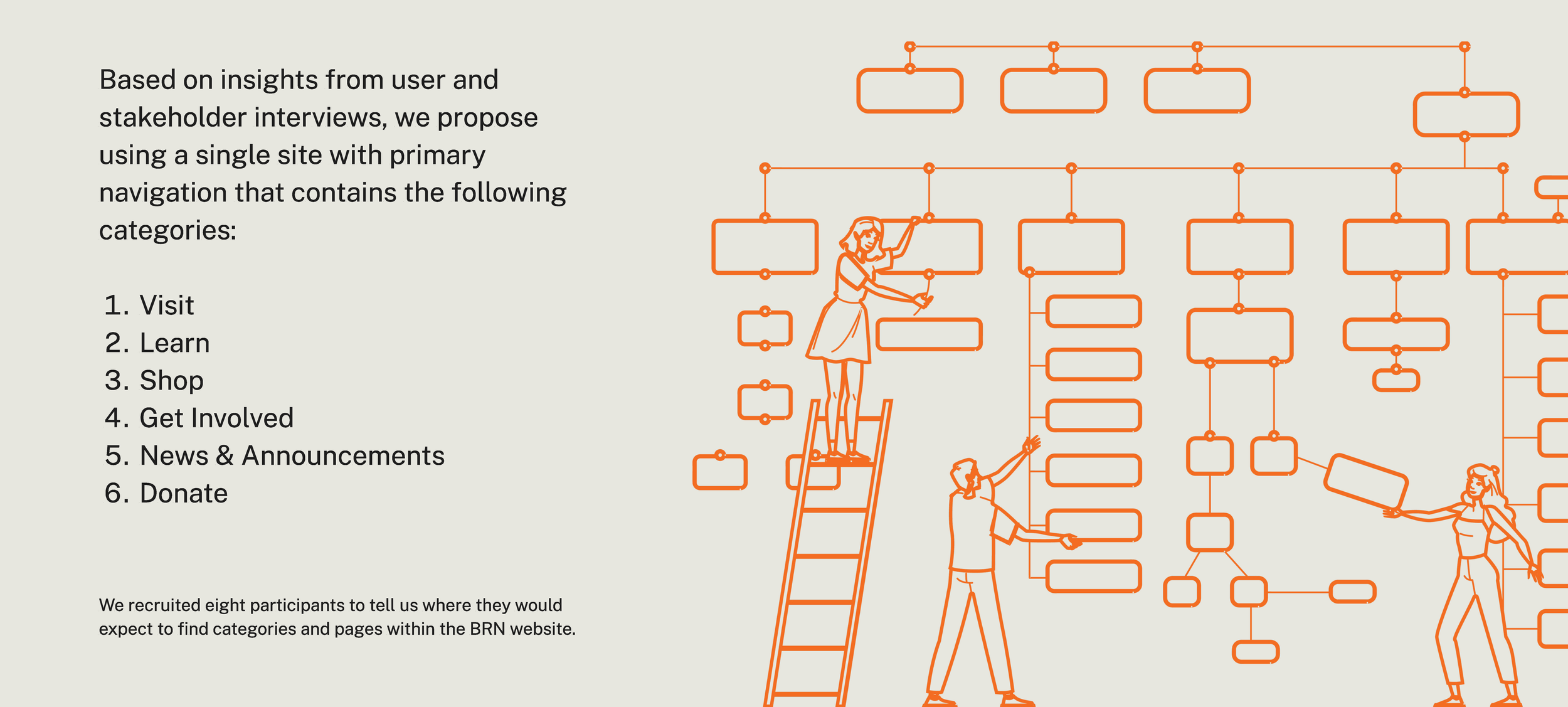
We leveraged stakeholder and user interviews to identify common challenges and priorities and to understand user needs and goals better. We were able to compile the priorities of the two user groups identified ( "stakeholders" and "users") and examined where their priorities converged, which identified strong needs for:
cohesive messaging: both with respect to BRN as a singular entity (instead of three branches), as well as product-specific information.
clarify that different factions within the organization are all part of the same entity. Current language contributes to the misunderstanding that work occurs in silos.
making resources more visible and accessible by providing just enough info on resources and links so that users understand what type of content they will find within a link or file. More specific, unique information that lends context and actionable insight for users is needed.
content exists on the website, but users either don't realize it's there or cannot find it. For example, BRN has robust plant information resources, but users are unable to locate it.
lack of a shared language contributes to miscommunication between users and BRN. Use of plain language and context clues will aid users in understanding navigation and content
user insights
Who we’re designing for: Here we have a few quotes from user interviews. Some voiced concern about finding information, others spoke to volunteering, and others tout the nursery offerings.
“I’ve been searching online, looking for various organizations where I could get actual material”
“BRN is trying to make a difference, and they’re not necessarily looking to make a lot of money... So anything I can do to help, I feel is a good thing”
“There are certain pieces of information it would be helpful to have... plant family information, that would be very helpful”
user personas
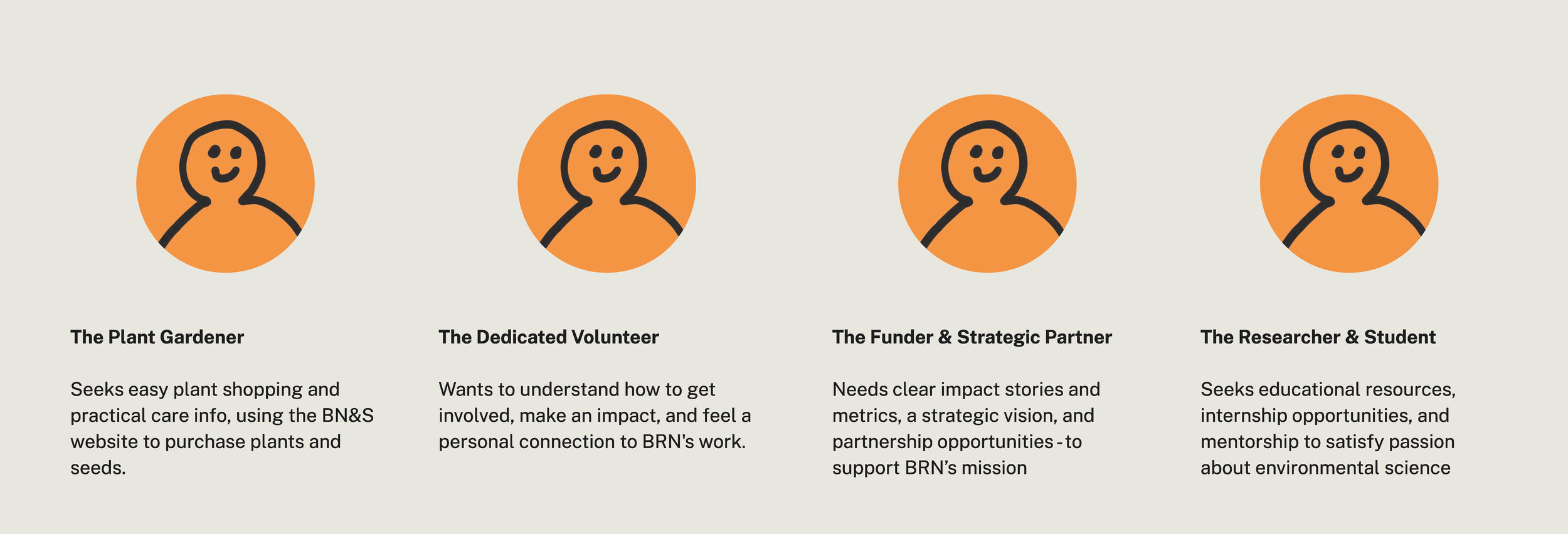
To ensure our recommendations are user-centric, we developed four key personas based on our user interviews. These personas represent the site's diverse audience segments and highlight their distinct goals and needs:
The Plant Gardener wants seamless plant shopping and practical care guides.
The Dedicated Volunteer is passionate about your local, grassroots efforts and seeks clear ways to get involved.
The Funder & Strategic Partner is interested in BRN's strategic vision, quantifiable impact, and opportunities for meaningful contributions.
The Researcher & Student is passionate about the environment and looks for educational resources and internship or early career opportunities
Each persona informed how we believe the website needs to be structured to serve their specific needs effectively.
research + approach
As part of the research process, we conducted a hybrid card sort, which asks users to categorize topics or items into groups based on what makes sense to them.
process: iterative sketches
Notes from the interviews were compiled and synthesized. This information was used to create iterative sketch work of structure variations in progress.
Recommended site structure
This is a visual representation of what we envision for the site structure. Each box represents a page, and each full-color box represents a main navigation page. The less saturated boxes that fall beneath each nav page represent a subpage within that category.
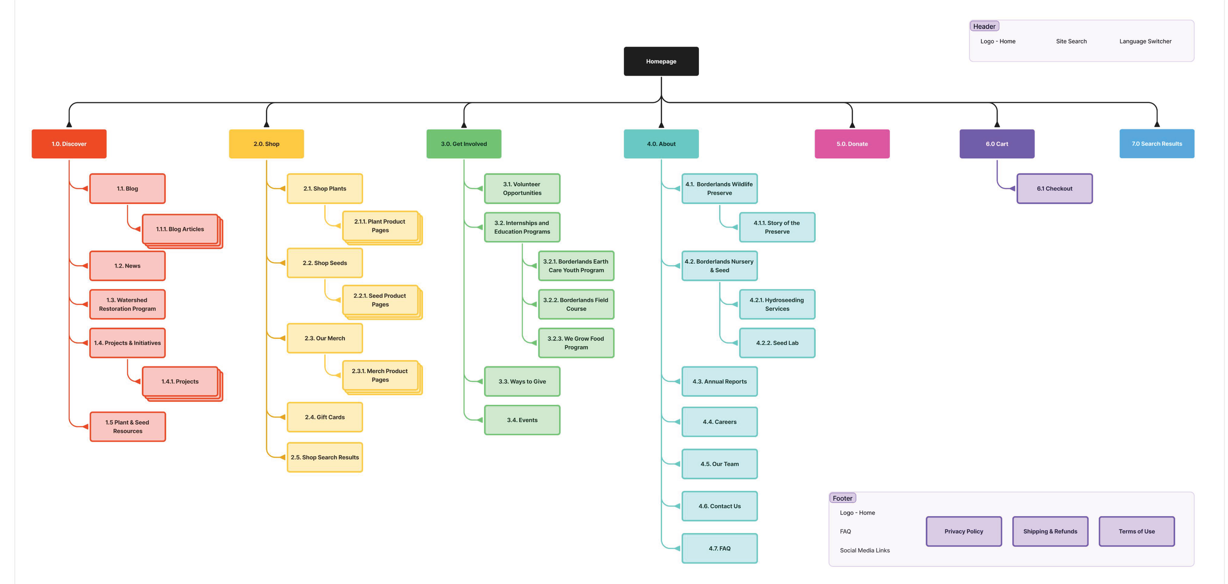
proposed web strategy
This is a visual representation of what we envision for the site structure. Each box represents a page, and each full-color box represents a main navigation page. The less saturated boxes that fall beneath each nav page represent a subpage within that category.
01
plain language
Friendly towards users who are not already familiar with BRN
04
streamline
Make it easier for users to understand their options and make decisions
02
accessible
Ensure ADA-compliant color contrast and appropriate alt text
05
inform
Clearly articulate the organization’s mission, vision, and values
03
concise
Keep relevant information together to prevent missed content
06
consistency
Use consistent branding and functionality to enable confidence in navigation

content recommendations
We recommend limiting content on the homepage to key activities of the organization (e.g., events, news, programs, volunteer opportunities, shopping, donations, etc.). Some sections rely on a preexisting understanding of BRN's programs. Alternatively, we recommend displaying a few program examples with links to their respective pages. We also recommend incorporating content from the Borderland Nursery & Seeds website into the site search to increase discoverability of BN&S content. Avoid using a third party for ‘Donate’ to increase trust for users who are about to enter sensitive payment information. There are no modifications needed for the Cart page, except for global accessibility recommendations.
01
home
04
cart
These four subcategories represent where the bulk of site content lives within our proposed structure:
get involved
Volunteer Opportunities
Internships & Ed Programs
Borderlands Earth Care Youth
Borderlands Field Course
We Grow Food
Ways to Give
Events
about
Borderlands Wildlife Preserve
Story of the Preserve
Borderlands Nursery & Seed
Hydroseeding Services
Seed Lab
Annual Reports
Careers
Our Team
Contact Us
FAQ
02
donate
discover
Blog
Articles
News
Watershed Restoration Program
Projects & Initiatives
Mansfield Mine Reclamation
Invasive Grasses
Pollinator Corridors
Agaves for Bats
Plant & Seed Resources
03
search
shop
Shop Plants
Shop Seeds
Shop Merch
Gift Cards
design recommendations
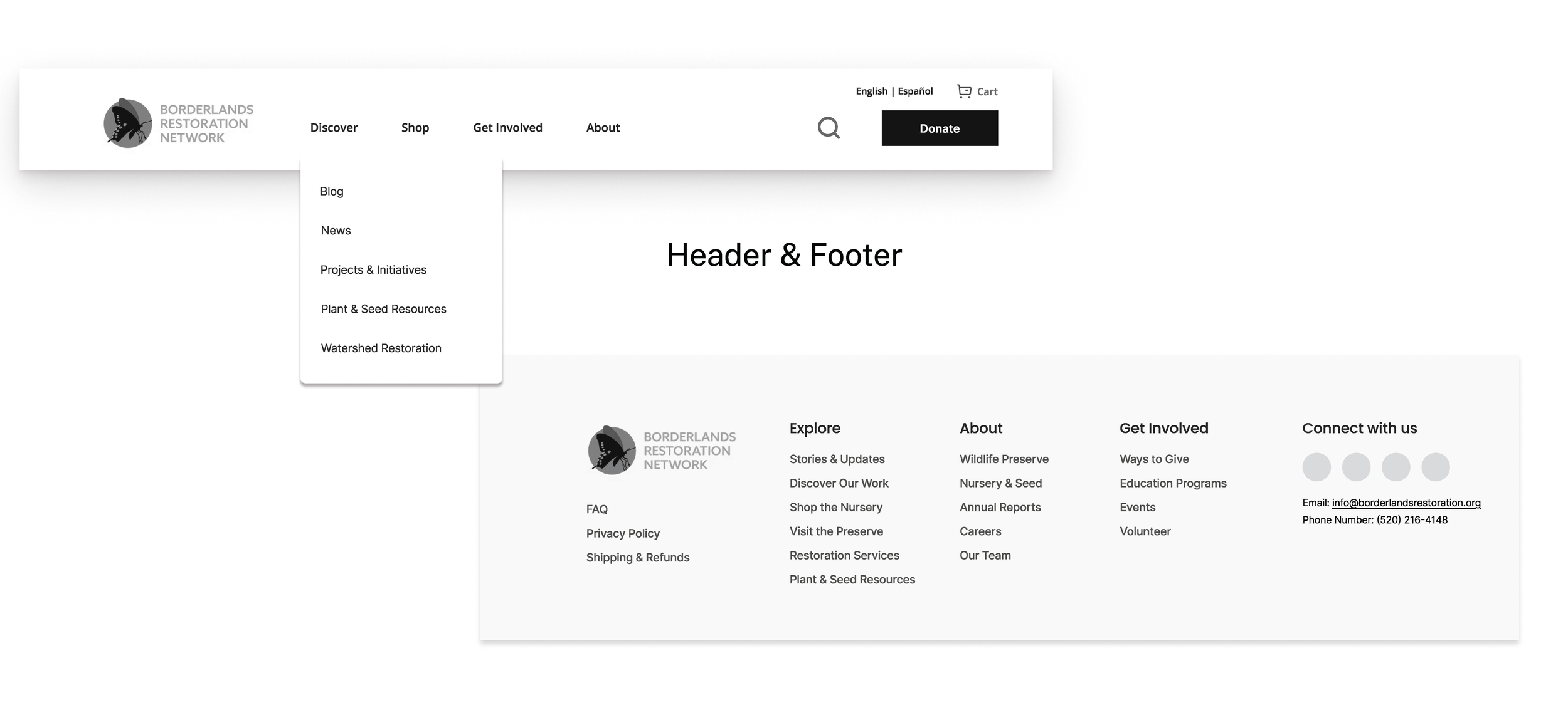
Starting with the top navigation bar, available at the top of every page, you can see a consolidated navigation, one site search, and a unified brand with just the one logo that always navigates the user back to the homepage. This navigation simply but effectively introduces users to core mission areas and provides immediate paths to key sections for each user persona.
This footer concept, available at the bottom of every page, is an even simpler way to access the most important content on the site.
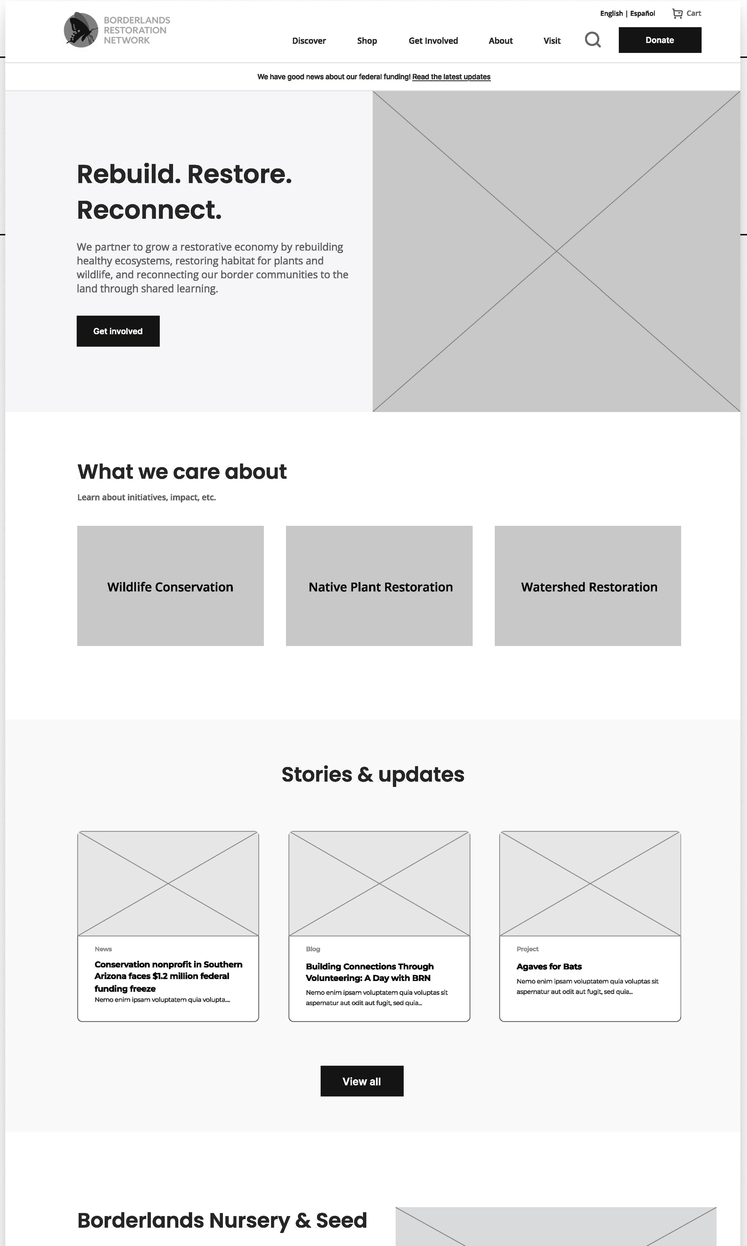
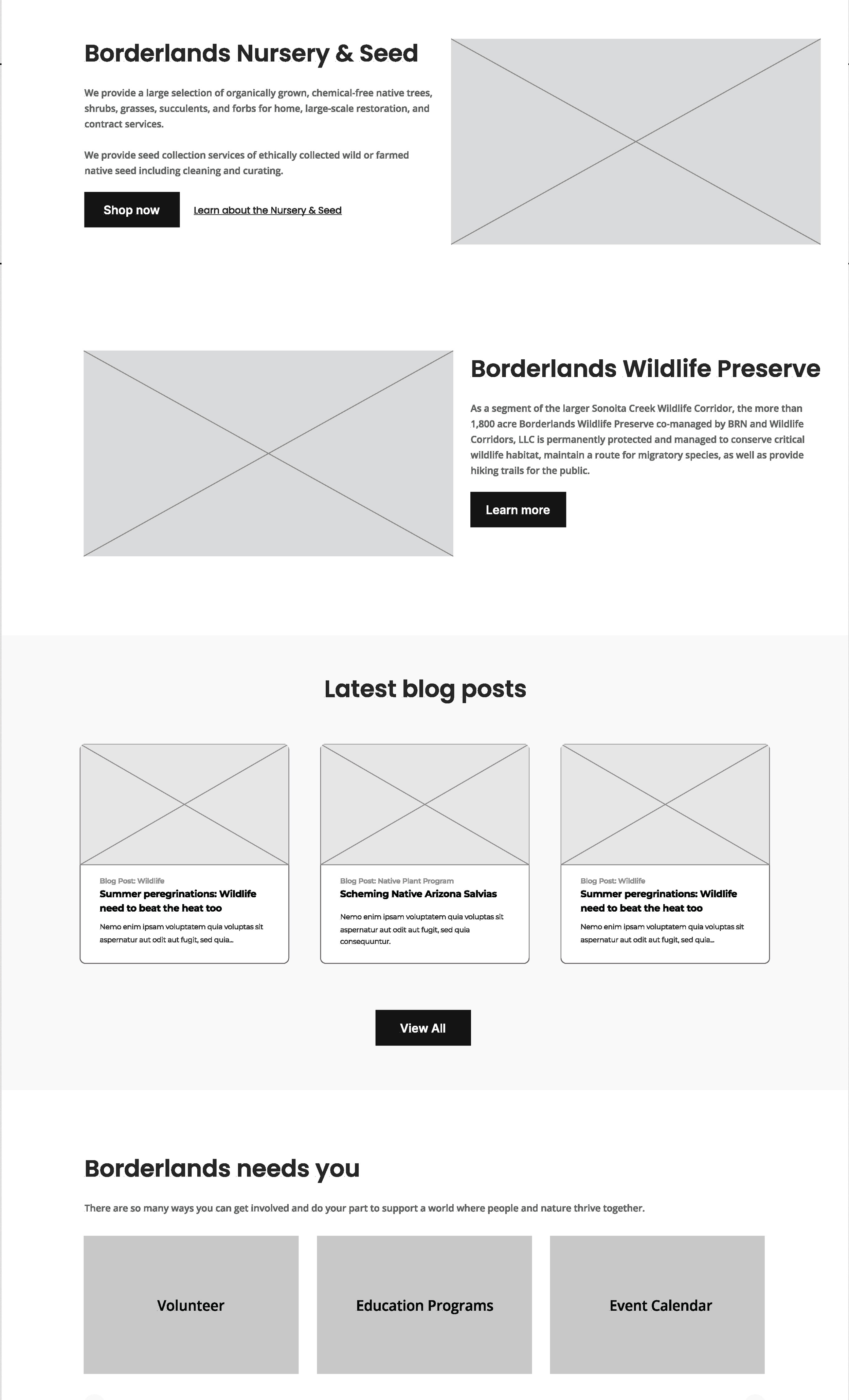
As the page that receives the most traffic, the Homepage must be designed as the central hub. While the main call to action here is to find out ways to get involved, it acts as a gateway to the latest website content, key projects, and initiatives. This puts front and center the information website visitors need about what BRN does and cares about, why visitors should care, and invites direct exploration of the most important content.
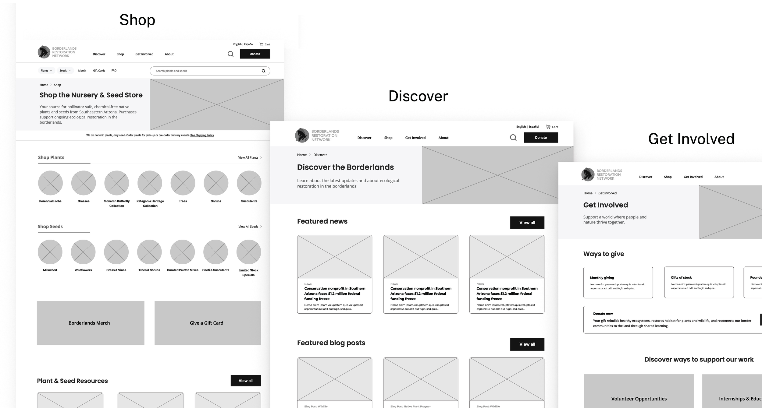
For broader nav categories, the Shop landing page demonstrates how we integrate the plant and seed shopping experience directly into the main site. You'll see clear categories on one page for 'Shop Plants' and 'Shop Seeds' that link out to more robust listing pages, making products easily discoverable.
The Discover landing page is a new hub for all plant/wildlife information, news, and stories. It addresses the challenge of scattered content by pulling together 'Featured news,' 'Featured blog posts,' and 'our projects and initiatives' all in one place that catch the users' attention with up-to-date and relevant content and links out to more robust pages. This should serve the Funder persona well with all the mission-driven content.
Finally, the Get Involved landing page centralizes all pathways for engagement. Users are met with prominent donation options, and prominent sections for 'Volunteer Opportunities' and 'Internships & Education Programs' ensure all supporters can quickly find how to contribute time or resources to BRN's mission. This will serve the Dedicated Volunteer and Student personas well when looking for ways to get involved.
Design: Gina Block, Matt Gramcko
Photography: Borderlands Restoration Network
Research: Gina Block, David Prior, Matt Gramcko
Copywriting: Gina Block, David Prior, Matt Gramcko